Fleet Industry
Research-driven colour and accessibility work for a fleet management application serving more than 68,000 users.
- Organisation
- Verizon Connect
- Product audience
- 68,000+ users
- Focus
- Usability and accessibility
01
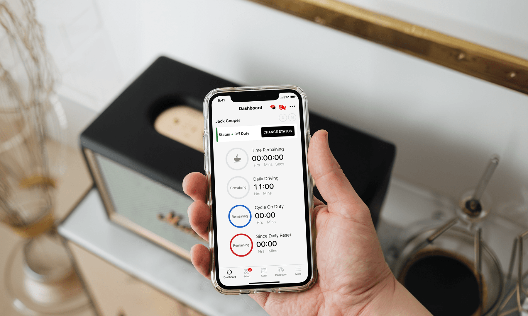
An everyday enterprise experience
Fleet management tools support repeated, detail-oriented tasks. Colour, hierarchy and legibility matter because people need to recognise information while moving through familiar workflows.
02
Research-driven visual decisions
This project involved a research-driven colour palette change across the fleet management experience, with usability and accessibility at the centre of the design work.
- Colour as a functional part of the interface
- Consistent visual treatment across the application
- Accessibility alongside established user habits
03
Scale is context, not an outcome
The application served more than 68,000 users. That figure describes the audience for the product, not a measured increase in usage or a result attributed to the redesign. The work demonstrates attention to how visual decisions affect a broad user base.
Research artefacts and measured before-and-after results are not published in this overview. I can talk through the design context directly.